All in One View
Content from Why Visualize Data: Readings
Last updated on 2026-04-28 | Edit this page
Before proceeding to the lectures and coding interactives below, take about 10 minutes to read the essay below about why data visualization is important in STEM, and what can be learned from W.E.B. Du Bois’ innovative visualizations from the 1900 Paris World Exposition. At the bottom of the reading, you can also browse some of Du Bois’ charts from the exposition.
After reading the essay, take another 10 minutes to read this article by Anthony Starks’ on the #DuBoisChallenge from Nightingale: Journal of the Data Visualization Society. The article explains how scientists, students, and data visualization enthusiasts began an annual challenge to recreate and learn from Du Bois’ visualizations using modern programming tools like Python and R.
Why Visualize Data: Creative and Visual Thinking in the Case of Du Bois
Academic and professional undertakings often present us with questions that are hard to answer with words alone. Creativity is often valuable for answering the hardest questions, including scientific ones. And visualization of concepts and data can be an important creative tool for formulating and answering questions. Because science and most professions involve collective undertakings, you will also need to communicate your ideas and analysis to others. Visualizations can again be a powerful creative tool towards this end. Cascades of mind numbing data will often lose your audience and collaborators.
Recent scholarship (Conwell and Loughren 2024; Itzigsohn and Brown 2020; Morris 2017) and social media initiatives (Starks 2022) have recentered Black sociologist W. E. B. Du Bois’s foundational contributions to social scientific and statistical methods at the turn of the 20th century. After receiving a PhD from Harvard, DuBois was among the first professors in the nation to train students in empirical methodologies. He involved his students in field work, including large scale quantitative surveys, wherein they collected and analyzed data on the Black community and race relations. Because these students were taught to think scientifically and engage in data analysis, the most advanced of the group became valuable collaborators (Morris 2017; Battle-Baptiste and Rusert 2018). Du Bois and this team used rigorous yet accessible methods, including data visualization, to empirically challenge the false claims of eugenics and scientific racism.
The Du Bois team notably used innovative data visualizations to tell data stories about Black Americans for broad audiences. By linking visualizations with a coherent narrative, data stories help audiences to better understand and remember ideas and evidence from visualizations. They chronicled the educational and economic success of Black Americans following emancipation from slavery (Battle-Baptiste and Rusert 2018). Du Bois drew heavily on infographics and artistic media (see architecture scholar Mabel O. Wilson in Battle-Baptiste and Rusert 2018). For example, the Du Bois team prepared more than 50 data visualization posters for an Exhibit featured at the 1900 Paris Exposition world’s fair. The Du Bois visualizations won the Exposition’s Gold Medal for their quality. The posters are now preserved in the Library of Congress.
Just as the Du Bois team used data stories to chronicle Black success after slavery, we can use Du Bois’ own story to learn data visualization methods for a range of scientific applications. Below, you can browse a subset of the Du Bois posters from the 1900 Paris Exposition. Du Bois uses variations of all of the major chart types still in use today: 1) bar charts, 2) line charts, 3) pie charts, and 4) statistical maps. Together, the posters presented a unified narrative of Black empowerment. The poster series prefigured subsequent research findings regarding the importance of visualization and storytelling in STEM education (Friendly and Wainer 2021; Hill and Grinnell 2014).
With the posters, Du Bois and his collaborators made some of the other earliest known deployments of statistical methods in social science. For example, the posters employ categorical data analysis and visualization. Du Bois’ innovative techniques also include clustered bar charts to present partial tables that control for confounding factors. Du Bois used this method to disprove racist myths about Black family structure by showing higher marriage rates among Blacks than among Germans after controlling for age. Du Bois employed this partial table technique sixty years before it became state of the art (Treiman 2014). Du Bois also produced some of the earliest cartographical visualizations of geosocial data. Triangulation of qualitative and quantitative data
Du Bois’ collaborators included women, such as social worker Jane Addams and sociologist Isabel Eaton. The two women contributed to the expansion of survey research and advancement of statistical methods around the turn of the 20th century (Morris 2017; Williams and MacLean 2015).
Du Bois insisted that science be built on careful, empirical research but must go further to garner notice beyond narrow circles of academics. As noted above, Du Bois and his Atlanta University team thus produced modern graphs, charts, maps, photographs and other items that appeared to sparkle for the 1900 Paris Exposition (Battle-Baptiste and Rusert 2018). As Morris has documented (2017), the intent was to convey weighty social scientific ideas in a fashion far more attractive than dispassionate arguments and dense statistical tables.
References
Battle-Baptiste, W., & Rusert, B. (Eds.). (2018). W. E. B. Du Bois’s data portraits: Visualizing Black America. Chronicle Books.
Conwell, J. A., & Loughran, K. (2024). Quantitative inquiry in the early sociology of W. E. B. Du Bois. Du Bois Review: Social Science Research on Race, 21(2), 368-390.
Du Bois Visualization Style Guide (https://github.com/ajstarks/dubois-data-portraits/blob/master/style/dubois-style.pdf)
Friendly, M., & Wainer, H. (2021). A history of data visualization and graphic communication (Vol. 56). Cambridge: Harvard University Press.
Hill, S., & Grinnell, C. (2014, October). Using digital storytelling with infographics in STEM professional writing pedagogy. In 2014 IEEE International Professional Communication Conference (IPCC) (pp. 1-7). IEEE.
Itzigsohn, J., & Brown, K. L. (2020). The sociology of W. E. B. Du Bois: Racialized modernity and the global color line. NYU Press.
Morris, A. (2017). The scholar denied: W. E. B. Du Bois and the birth of modern sociology. University of California Press.
Starks, A. (2022). The #DuBois Challenge. Nightingale: Journal of the Data Visualization Society.
Treiman, D. J. (2014). Quantitative data analysis: Doing social research to test ideas. John Wiley & Sons.
Williams, J. E., & MacLean, V. M. (2015). Settlement sociology in the progressive years: Faith, science, and reform (Vol. 75). Brill.
A Sample of the Du Bois Visualizations from the Paris Exposition
Note that the plate numbers referenced below are from [W. E. B. Du Bois’s Data Portraits: Visualizing Black America] (https://papress.com/products/w-e-b-du-boiss-data-portraits-visualizing-black-america)
Figure 1: Time series graph

One of the rare line charts in the collection, the comparative population growth of white and Black Americans from 1790-1890, is annotated with relevant events like “Suppression of Slave Trade”, Immigration” and “Emancipation”.
Figure 2: Time Series Percent Area Graph
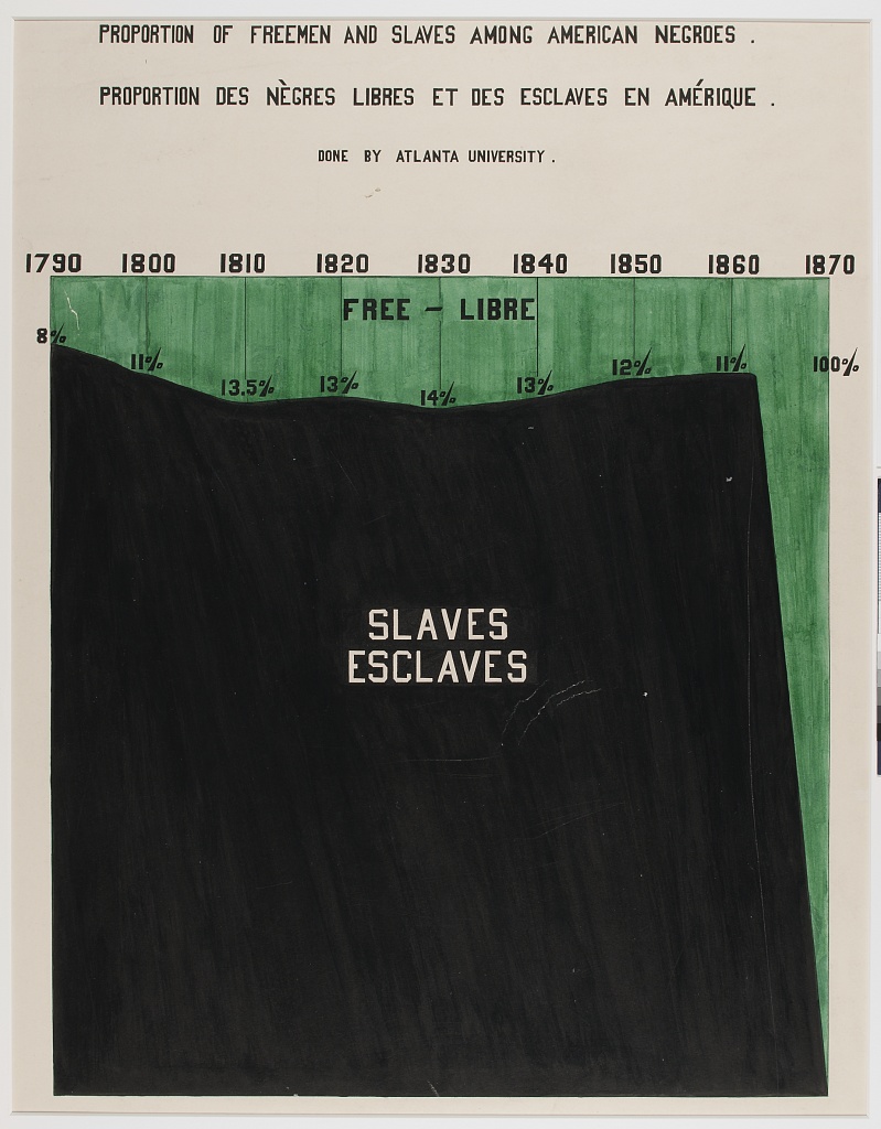
With the green waters of Freedom plunging down a waterfall set on the dark base of slavery, “Proportion of Freeman and Slaves Among American Negroes” shows number of enslaved and free from 1790 to 1870.
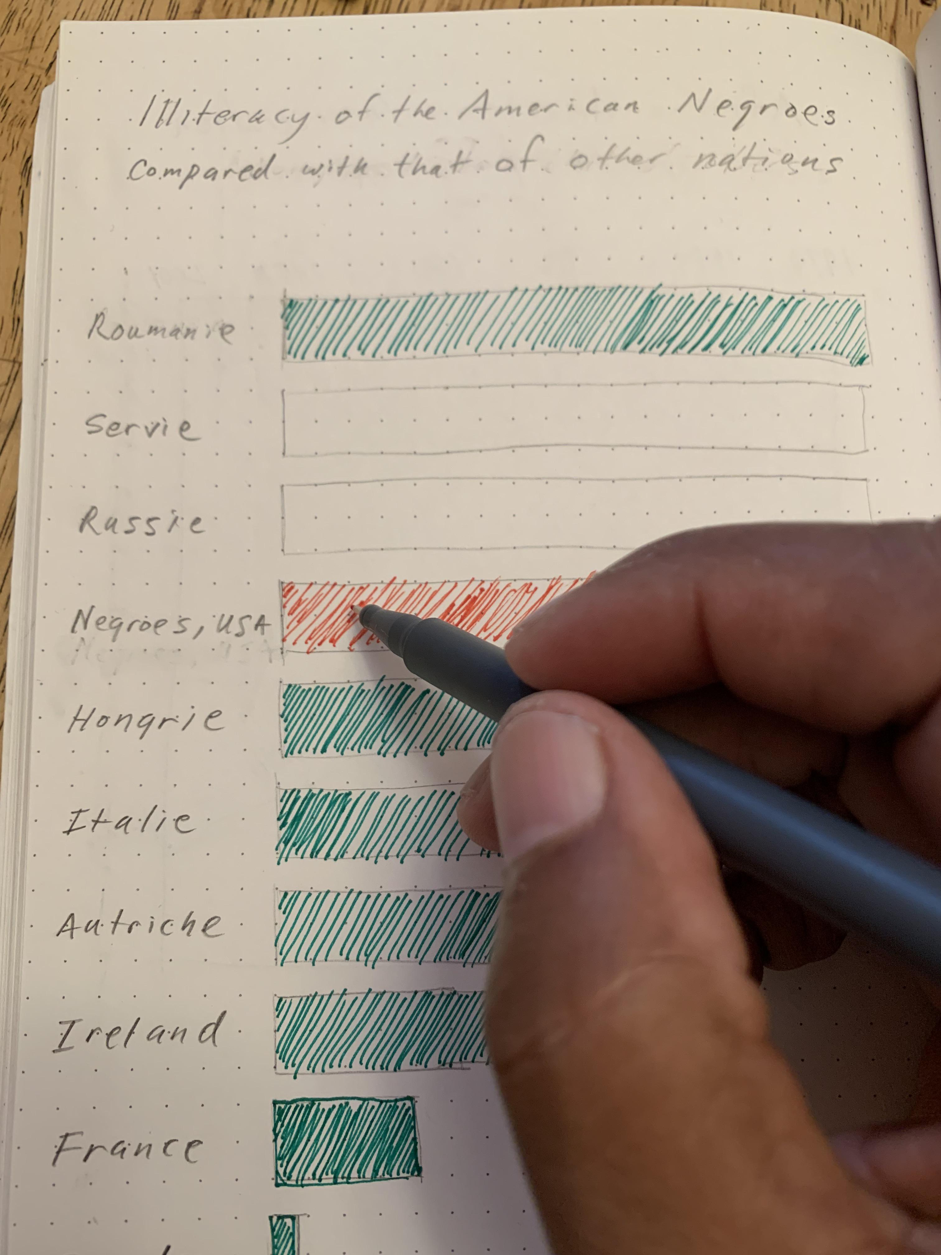
Figure 3: Percentage Bar Graph of Dichotomous Variable Status(literacy) By Select Categories (National / Racial Community)
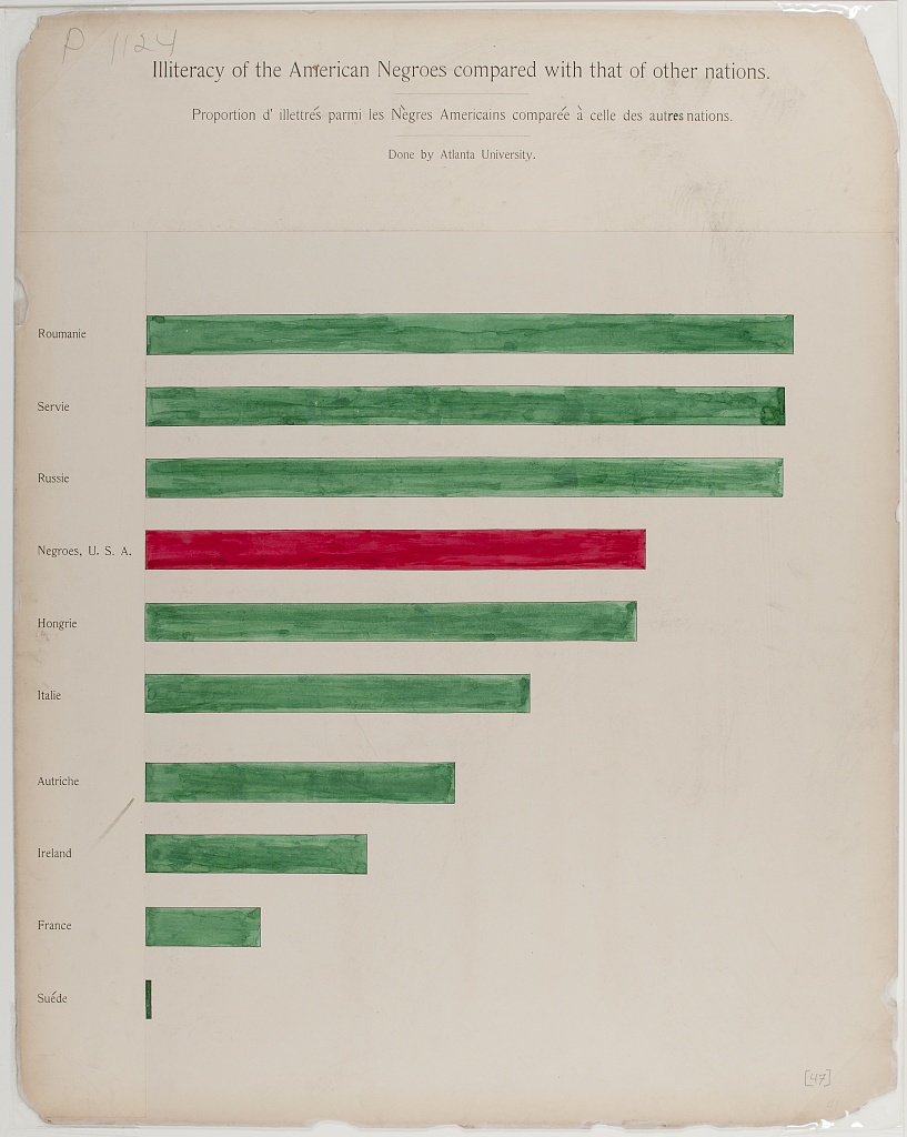
Comparing the state of Black Americans with the larger world, “Illiteracy of American Negroes compared with that of other nations” shows Black American’s illiteracy in red, in the middle of a sea of green, higher than countries like France, but better than others like Russia.
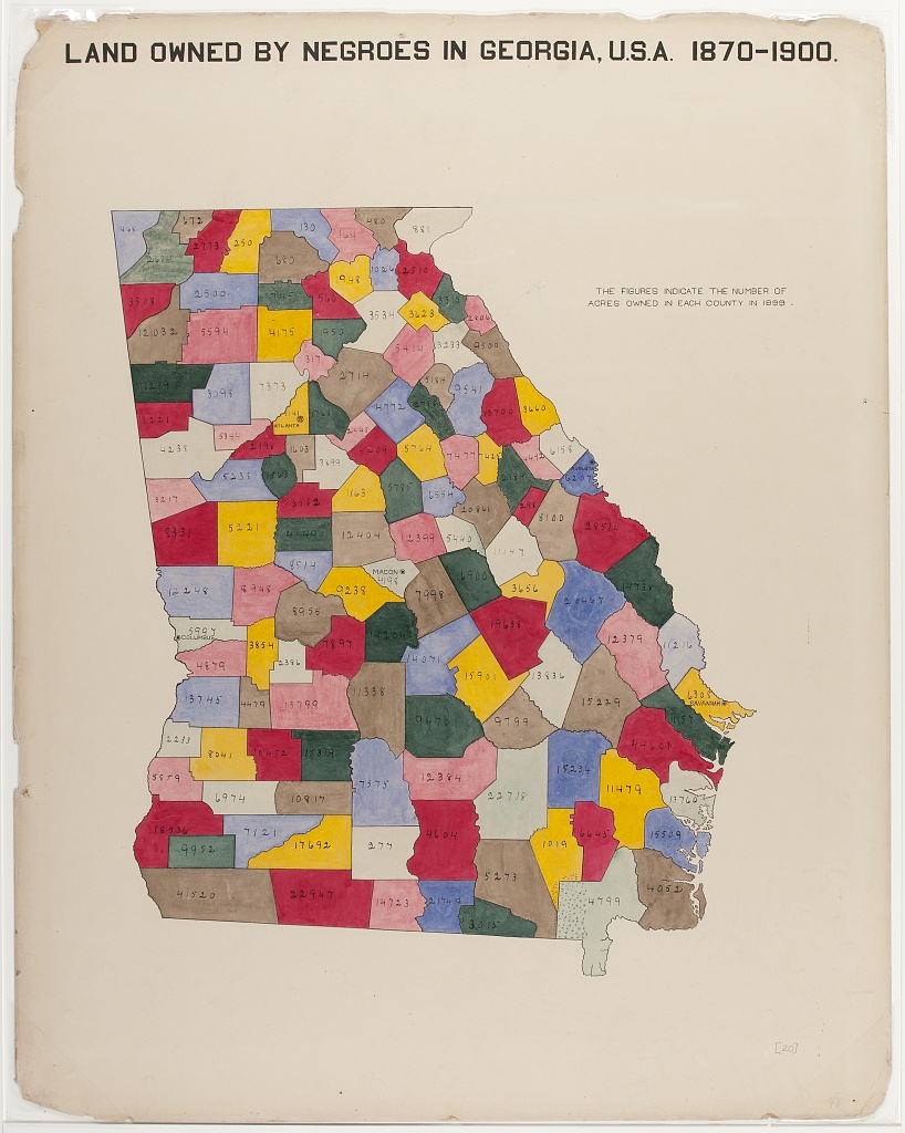
Figure 4: Categorical Map of Population Location With Population Size Legend
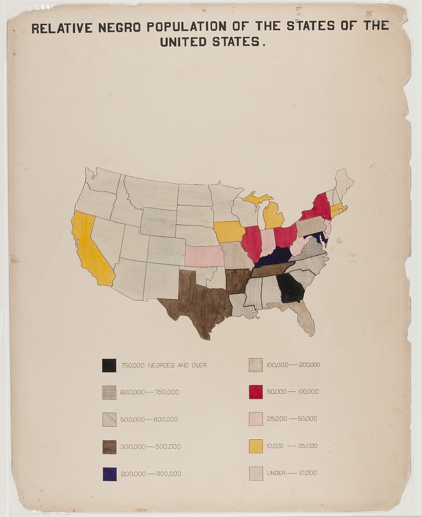
A choropleth outlining the population of Black Americans, by state. Note the concentration in the South, with Georgia leading (750,000 or more).
Figure 5: Fan Chart for Categorical Percentage Distributions in Two Comparison Groups
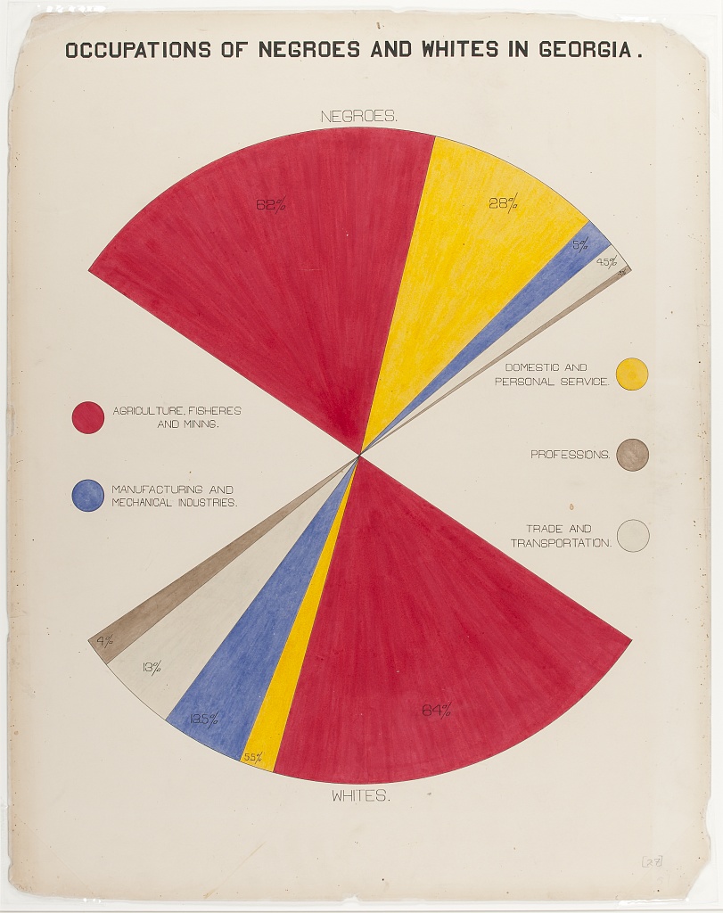
The fan chart compares Black and white population’s occupations, using color and area to faciliate comparisons.
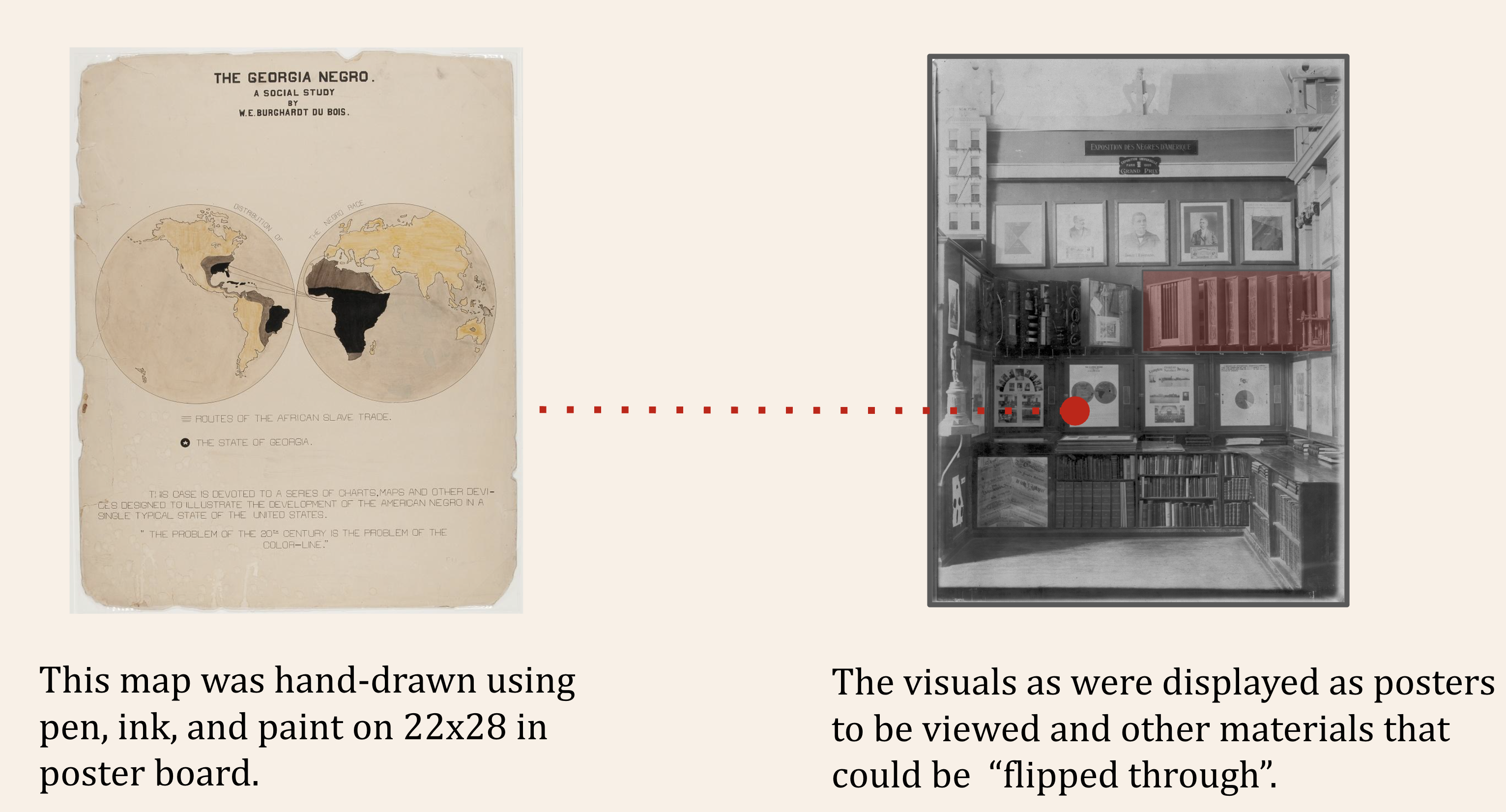
Figure 6: Cartographical Visualization of Population Location and Movement
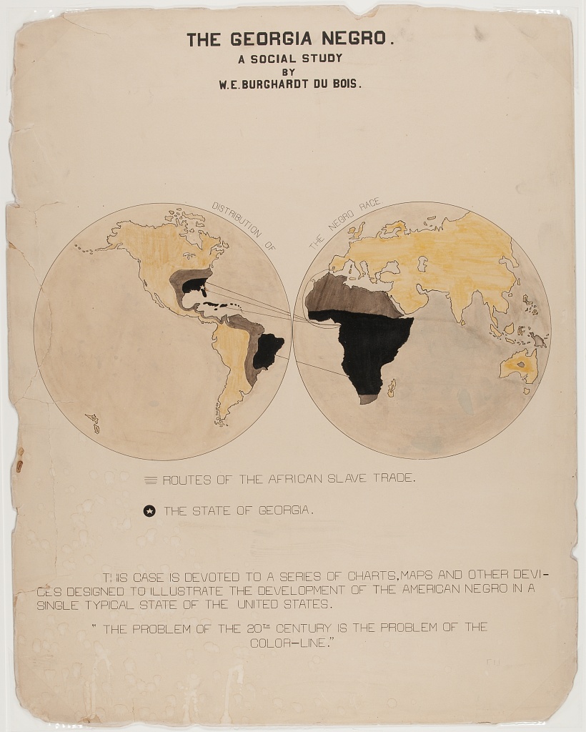
“The Georgia Negro, A Social Study” shows the transatlantic slave trade, with routes from Europe, Africa, the Americas and the Caribbean, highlighting Georgia. This visual contains Du Bois’ famous assertion: “The problem of the 20th century is the problem of the color line”
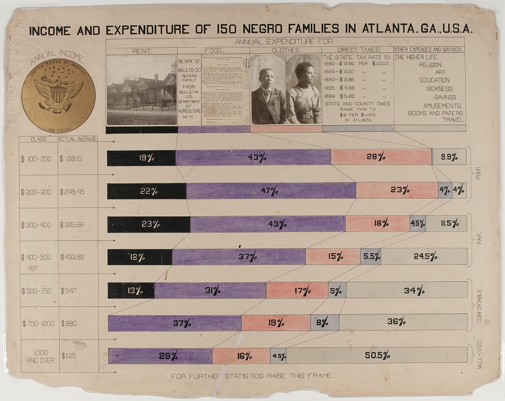
Figure 7: Multivariate stacked bar graph by continuous covariate brackets, with photographic and other data element details

The horizontal stacked bar charts show how various economic groups spend their income among these categories: Rent, Food, Clothes, Taxes, and other expenses and giving. This visual is distinct in that it includes photographs along with the chart.
Figure 8: Partial Table Bar Graph – i.e. Bivariate Categorical Relationship (Marriage Status by Racial / National Group) Broken Control Variable (Age)
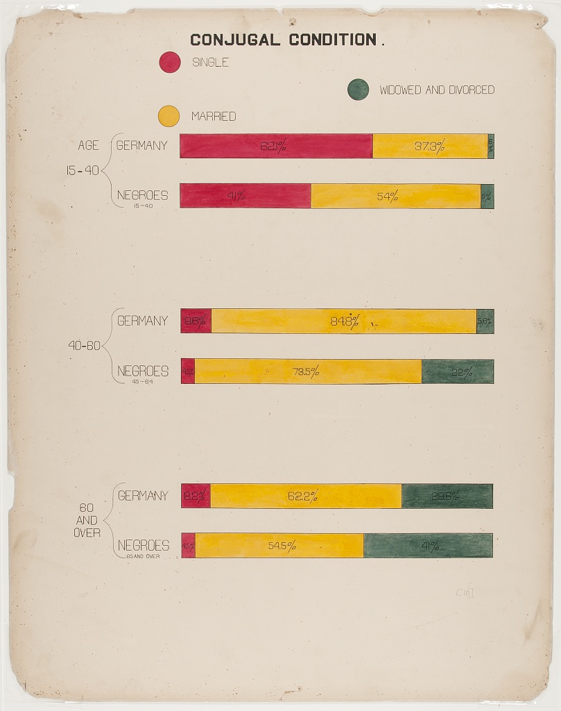
The “Conjugal Condition” visual compares three groups (single, married, widowed and divorced), divided by age: (15-40, 40-80, and over 80) within two populations: Black Americans and the country of Germany. The data is shown clearly using six proportional bar graphs in the red, yellow and green color scheme.
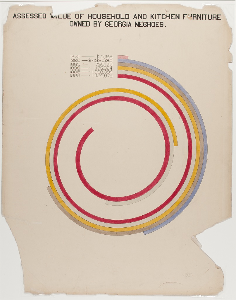
Figure 9: Bar/Spiral chart Uses color and contrasting lengths to highlight quantitative demographic differences.
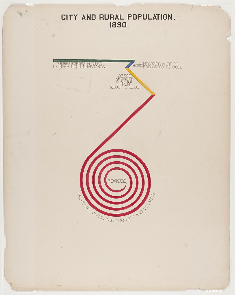
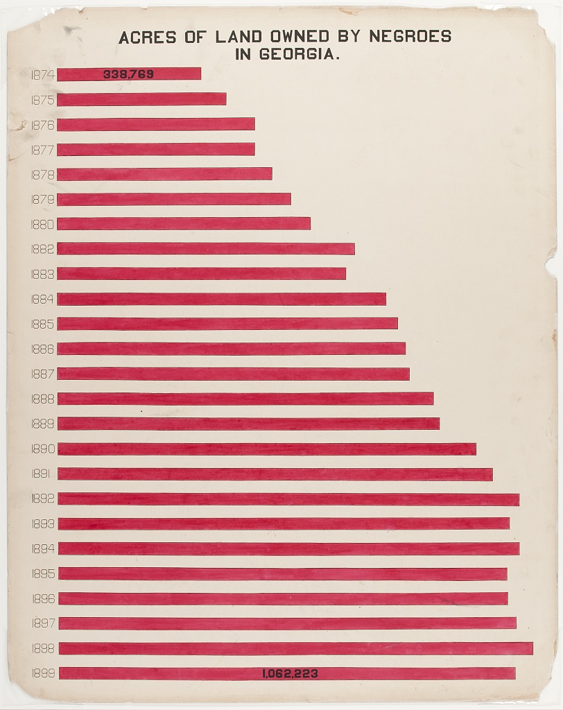
Figure 10: Bar Chart
“Acres of Land Owned by Negroes in Georgia” is a conventional bar chart with a twist. The chart shows the increase of land owned between 1874(338,769 acres) and 1899 (1,023,741), with the red shape of the data echoing the map of Georgia.
Content from Data Visualization Now
Last updated on 2026-04-28 | Edit this page
Learning from the Innovations of W.E.B. Du Bois
This content is also available in Google Slides that can be copied and edited.
Overview
Questions
- How can data visualization and creativity help answer important scientific questions?
- Why did data visualization become predominant in the social sciences earlier than for physical and natural sciences?
- How did Du Bubois use data visualization to challenge false biological theories of racial inequality?
- How did team science help Du Bois’ team to create impactful visualizations for the 1900 Paris exposition?
Objectives
Understand how data visualization promotes scientific discovery.
Explain early innovations in data visualization by W.E.B. Du Bois and other Black and women scientists in his Lab.
Analyze the appropriate types of data visualization charts for different kinds of measurements, relationships, and scientific findings.
Engage in a creative process of data visualization in the style of W.E.B. Du Bois, by applying techniques by hand and with statistical software.
Visualizations Help Formulate New Hypotheses
If I can’t picture it, I can’t understand it. – Albert Einstein
The first thing scientists want to do is understand an issue correctly. Visualizing data with charts, in contrast to tables, helps scientists understand data because:
It is often difficult for people to view a large dataset in a table comprehensively.
People are able to identify concrete patterns and associations more easily in data visualizations.
Why Communicate Through Visualizations?
Another thing scientists need to do is to communicate their findings effectively. Visualizing data is important to scientific communication because:
Scientific discovery requires communicating our ideas and evidence to other scientists who can challenge or build on our findings.
Charts, graphs, and other visuals can clarify associations between two or more things.
For example, health researcher Florence Nightingale used data visualization early on to communicate scientific findings in ways that the public and policymakers could use to save lives.
Why the History of Data Visualization Matters Now
The social scientist W.E.B. Du Bois provided one of the earliest models for effectively developing data visualizations, demonstrating how science matters for the most critical material and moral issues of the day
What Motivated DuBois?
Du Bois cared about the truth. He lived during a time when biological explanations were popular among scientist to explain racial inequality.
Du Bois asked, instead, how discriminatory policies and the material consequences of slavery created unequal outcomes in wealth, literacy, and well being. Du Bois and the Atlanta University Laboratory developed new questions for the US Census and conducted scientific surveys of the population. His Lab included investigators of different racial/ethnic backgrounds and it included women, which was not the norm at that time.
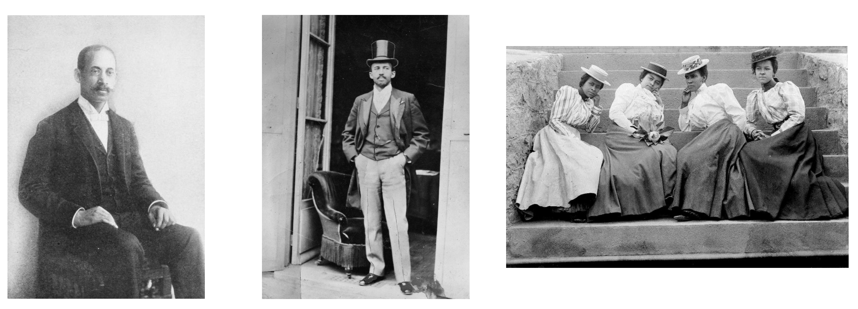
The figures show Thomas Calloway, the organizer of the “Exhibition of the American Negro”, Du Bois during the Paris Exposition in 1900, and Atlanta University Students, circa 1900.
Data Visualization as a Scientific Concern for the Du Bois Lab
The Du Bois Lab found evidence to refute theories that falsely claimed inherent biological differences between races.
The Du Bois Lab used creative visualizations to help their team work with new data, make new connections, and to ask critical questions about the objects of study
The Du Bois Lab communicated their evidence and arguments using data visualization that could be understood by wide audiences.
Communicating Science to the Public: The 1900 Paris Exposition
The 1900 World Fair in Paris provided a venue for Du Bois to challenge erroneous theories about racial difference and inequality. The exposition showcased the latest scientific discoveries and inventions to 50 million attendees from around the world.
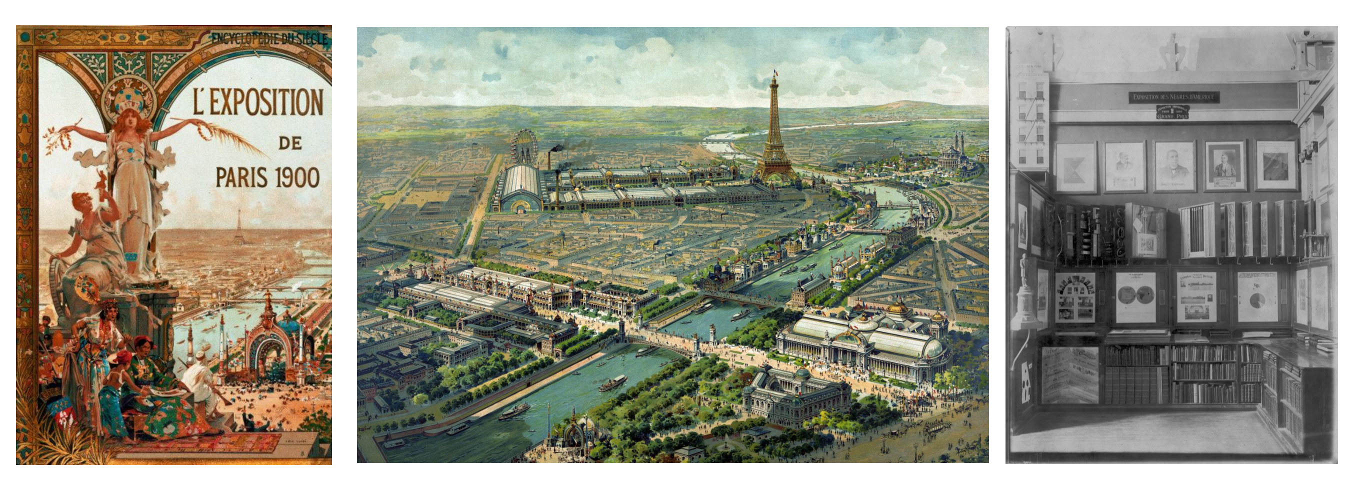
The figures show the Exposition Poster, a view of Paris, and the venue for the Exposition of the American Negro.
Motivation: What could a scientist do?
Overview
Questions
What could Du Bois do as a scientist to challenge widely believed but false theories of racial inequality?
How could Du Bois best present his ideas and evidence at the Paris Exposition with the technologies available to him?
What could you do today as a scientist to challenge theories about how a phenomenon operates that might be wrong?
In your potential career, how might you visualize data?
Objectives
Understand how data visualization promotes scientific discovery.
Explain early innovations in data visualization by W.E.B. Du Bois and other Black and women scientists in his Lab.
Analyze the appropriate types of data visualization charts for different kinds of measurements, relationships, and scientific findings.
Engage in a creative process of data visualization in the style of W.E.B. Du Bois, by applying techniques by hand and with statistical software.
Turning Data into Art
The Du Bois Lab creatively used charts to depict data about racial inequality.
This helped them show, for example, that when the US government ended bans on Black literacy in the South after Emancipation, illiteracy declined sharply.
The Lab even found that Black illiteracy had declined to lower levels than found in some parts of Europe where conditions of serfdom kept illiteracy high into the late 1800s.
Combining Different Art Forms
The Du Bois Lab used a range of charts that combined different kinds of data with visual art, including maps, photographs, and drawings, to detail change over time.
Praised and Preserved
What we remember and praise, we preserve. These charts have been praised for their ability to draw in viewers. The charts are also preserved in the Library of Congress. Fisk University also houses an archive of Du Bois data visualizations.


Recap (Overall Learning Objectives)
The central place of data visualizations in the process of scientific discovery and in communicating those discoveries. The history of the DuBois Lab exemplifies this.
It matters which type of chart or graph is used to depict a relationship, a cause, or a process. Some work better than others.
Science requires creativity for discovery. Data visualizations help communicate relevant scientific findings to audiences effectively.
Exercise 1
Why do you think Du Bois created a series of graphs and data visualizations of Black life for the exposition?
Why visualizations instead of a written report?
Du Bois used rigorous yet accessible methods to challenge subsequently discredited claims associated with scientific racism that devalued and assumed Black communities as inferior. The visualizations helped show some of the systemic barriers impeding the progress for black Americans as compared to a deficit approach that would suggest black people were somehow innately less capable. This is a paradigm shift in showing how social science can work together with other STEM fields to produce the most accurate science and impressive visualizations.
Discussion
What effect did the venue have on the design of the visuals?
Why do you think Du Bois created a series of graphs and data visualizations of Black life for the exposition?
Why visualizations instead of a written report?
What effect did the venue have on the design of the visuals?
References
(Paris Exposition of 1900 (Exposition Universelle)) [https://en.wikipedia.org/wiki/Exposition_Universelle_(1900)]
(Black America, 1895) [https://publicdomainreview.org/essay/black-america-1895]
(Plessy v. Ferguson) [https://www.britannica.com/event/Plessy-v-Ferguson-1896]
(The Philadelphia Negro) [https://www.google.com/books/edition/_/sqwJAAAAIAAJ]
(Wilmington Insurrection of 1898) [https://en.wikipedia.org/wiki/Wilmington_insurrection_of_1898]
(The Lynching of Sam Hose) [https://en.wikipedia.org/wiki/Lynching_of_Sam_Hose]
Content from Reading and Interpreting STEM Charts
Last updated on 2026-04-28 | Edit this page
This content is also available in Google Slides that can be copied and edited.
Overview
Questions
- What are the major STEM chart types, all used by Du Bois?
- What universal design practices can make charts more accessible and effective?
- How did Du Bois use these practices effectively in one of his charts?
Objectives
- Understand which chart types are best suited for data with different levels of measurement (nominal, ordinal, continous).
- Read and interpret the analysis in one of the Du Bois charts.
- Identify best practices for chart accessibity and impact in a Du Bois chart.
- Draw a STEM chart by hand using statistics that describe real data.
Video overview
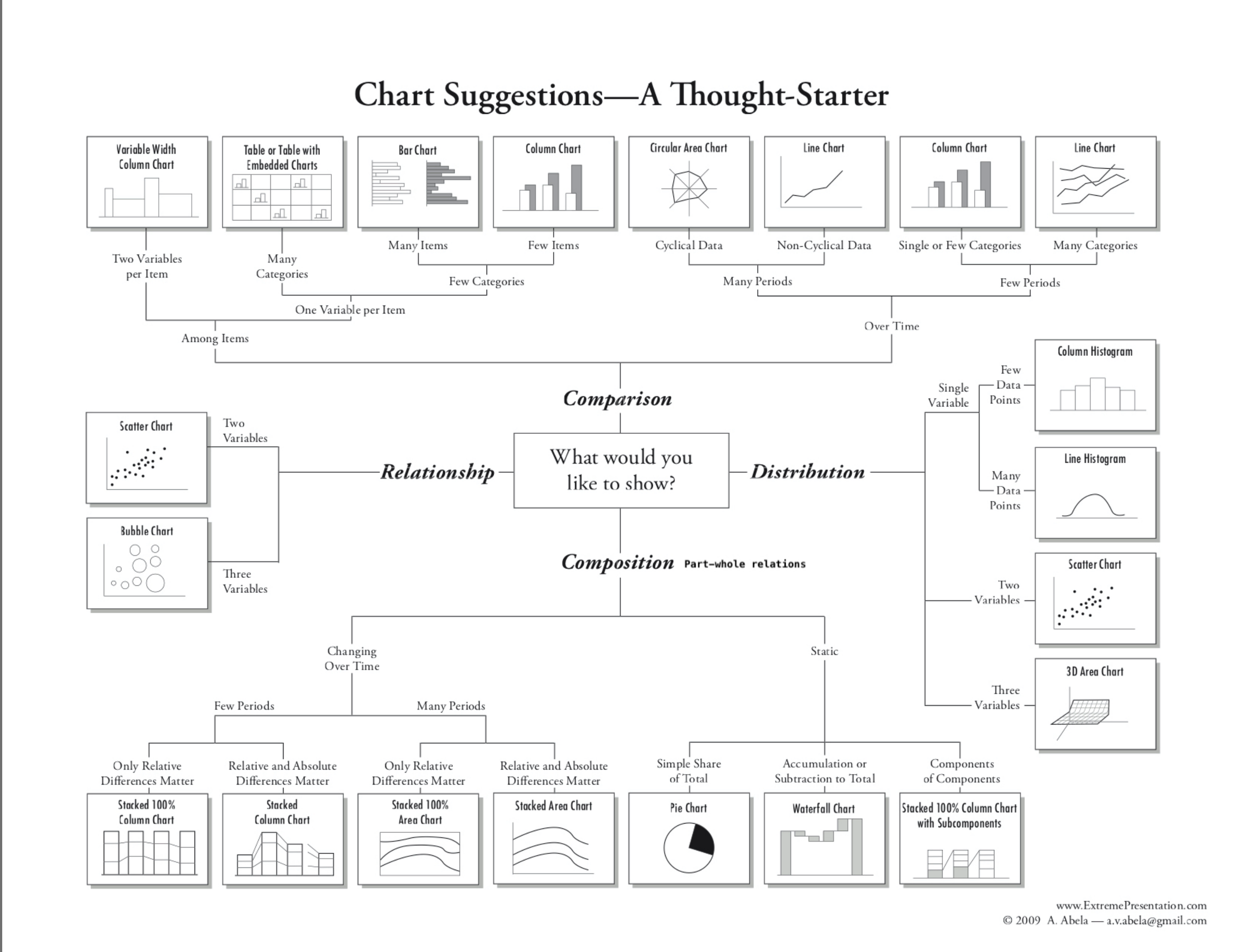
Chart Types
- We use different types of graphs based on the types of data and relationships we are analyzing.
- Du Bois used variants of most of the major graph types that are still used today: (pie, bar, cartesian line charts, and statistical maps).
More complex applications
- You can also explore more complex applications of these chart types using the [Du Bois Resources repository for this lesson:] (https://github.com/HigherEdData/Du-Bois-STEM)
- The types include the fanciful Du Bois spiral, stacked bar charts, and integrated photographs.


Chart Types and Types of Data
Types of Data
We use different chart types for different types of data. Two key types of data are sometimes referred to as levels of measurement:
- Categorical (also called nominal. Examples: demographic group, species).
- Continuous (also called interval ratio. Examples: distance, duration, quantity).
Types of Statistics
Charts commonly use visual elements to represent statistics computed from either categorical or continuous data, including:
- Proportions (from categorical data)
- Frequencies (from categorical data or a quantile of continuous data)
- Central tendencies like means, medians (from continuous measures)
Numbers of variables
- Different variants of charts are also used to represent data for multiple related variables.
- But even pie charts, which represent a distribution across categories of a single categorical variable, can be used to represent data for multiple variables by splitting the chart into separate panels for units in different subcategories.
Pie Charts
- Pie graphs illustrate the proportion (or percentage) of units observed in different exclusive categories (like occupations) within a population, with all the percentages adding up to 100%.
- This analyzes a distribution across one categorical variable.
- Du Bois’ fanchart variant of a pie chart below creatively compares distributions of people across one categorical variable (occupations) within categories for another variable (race).

Chart Types: Bar Charts
- Bar graphs compare statistics for one variable across bar categories for another variable.
- As in the graph below, a bar graph can represent statistics for a categorical variable like frequencies or percentages of literacy within bar categories of the other variable (in this case nation). This bar graph thus visualizes elements of a contingency table.
- A bar graph can also represent statistics of continous variables like means within bar categories of another variable.
- Cluster bar charts can be used for comparisons across additional categorial variables.

Chart Types: Cartesian Line Charts
- These graphs allow us to represent relationships between two variables with continuous measures.
- The line graph below represents the frequency of the total population within the white and Black categories of a race variable on the Y-axis over year as a continous variable on the X-axis.
- Line graphs can also use multiple lines for different categories of a variable (like race) to represent the relationship of a 2nd continuous variable (like average income) on the Y-axis between those categories and across variation in a third continous variable on the X-axis (like year).
- Scatter plots use a similar framework, plotting a point for each observed unit according to its continous observed values for one variable on the Y-axis and another variable on the X-axis. Regression or fitted lines then represent the relationship between these two variables.
- Time series line graphs, with time on the x-axis, are the most common type of cartesian line graph.
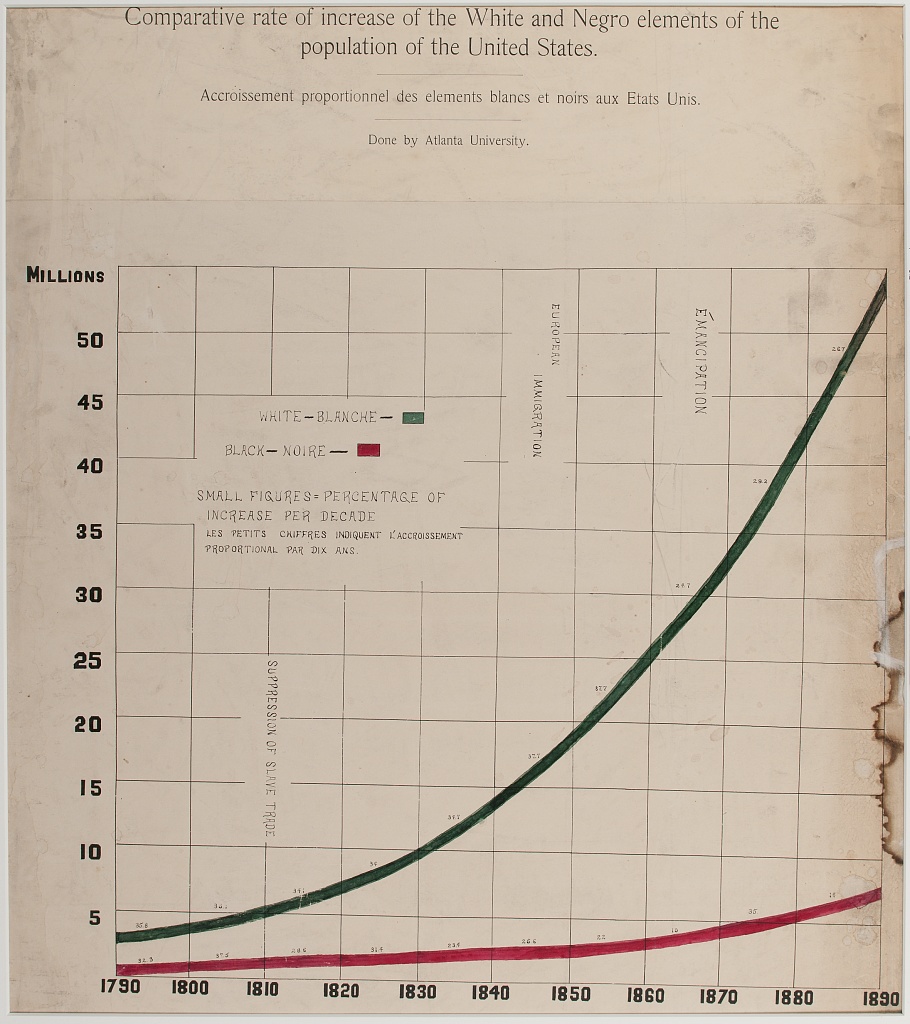
Chart Types: Statistical Maps
- Statistical maps graph geo-spatial distributions of continuous interval-ratio variables (like the Black population of the U.S.) across categorical geographic units like states.
- In our mapping activity, we review methods for choosing choropleth (color and shading) categories that represent different ranges of continous measures (like Black population size) between geographic units.

Other chart variants
This diagram offers a tool for choosing between additional variants of (chart types for different types of data and analyses:)[https://github.com/HigherEdData/Du-Bois-STEM]
Design Aesthetics and Accessibility
While Du Bois sought to make his visualizations accessible to broad audiences, advances in universal design practices do even more to make visualizations accessible to people with diverse visual, cognitive, auditory, or motor strengths and needs. Practices include:
Keeping visuals as simple as possible, presenting only information necessary for analysis.
Color-blind friendly use of color and contrast, avoiding over-reliance on color
Alternative text (alt text) that screen readers can use to provide an audio description of images.
Descriptive titles and labels
Offering both visual and non-visual formats
Including narrative text with context and summaries
Literacy Bar Chart: a worked example
Challenge 1: Reading the Chart
- What type of graph is this?
- What variables are plotted on the chart?
- Are the variables categorical, ordinal, or interval / ratio?
- What statistics are plotted?
- Which category is highlighted?
How does Black illiteracy (the red bar) compare with other countries
- What variables are plotted: Country, Illiteracy rate
- Variable types: Country is categorical. Illiteracy rate is continous, though it is derived from person-level categorical measures (literate or not literate)
- Statistics plotted: Proportions (as percentages) of llitercy rate
- The Black illiteracy rate is highlighted.
Disucssion
How does Black illiteracy compare to literacy in other countries on the chart?
What is similar about the countries with higher illiteracy than Black illiteracy in the US?
Design Aesthetics and Accessibility
Overview
Questions
What makes the bar chart above graph easy or difficult to understand?
How is the graph aesthetically appealing? How could could it be more appealing?
How does this graph take its audience into consideration?
What tools would you need to create this graph by hand?
Objectives
- Understand which chart types are best suited for data with different levels of measurement (nominal, ordinal, continous).
- Read and interpret the analysis in one of the Du Bois charts.
- Identify best practices for chart accessibity and impact in a Du Bois chart.
- Draw a STEM chart by hand using statistics that describe real data.
This visual, a conventional bar graph, uses spot color to highlight the data for Black Americans compared to other countries, showing the illiteracy rate to be at the midpoint compared to other nations.
The chart portion is a large percentage of the canvas, simply showing the message.
Note the bilingual labels and titles (a nod to the venue and audience).
Context and Data Story
Du Bois presented his graph for illiteracy among Black Americans and other nations (left), together with the graph of Black illiteracy in Georgia from 1865 to 1900. What data story do these 2 graphs tell together?

Example: Re-Create with Modern Data and Accessible Design
Activity: Hand draw a recreation of Du Bois’ graph using the data below on college attainment today.
Building on the graph to the left, what accessible design improvements can you make?
Data:
Country		College

Russia		60
Ireland		54
Sweden		49
France		42
Black U.S.
Residents	36
Austria		36
Hungary		29
Serbia		28
Romania		20
Italy 20- Even simple chart types can convey interesting meaning. Color man be used to emphasize points
Content from R coding interactives
Last updated on 2026-04-28 | Edit this page
These coding interactives use Jupyter Notebooks that you can open and use with any web browser without any software installations on your own computer. This is ideal for beginners with R who do not yet want to learn how to use the R studio interface on their own computers.
If you plan to use R in the future, however, we recommend that you instead try the activities from our R STEM Data Visualization with Du Bois lesson site. That site has activities with Du Boisian examples for learning to use R studio for data visualization on your own computer.
Interactive 1: Bar Charts of Literacy and College Attainment
Try it using Jupyter Lite. (Recommended. No installation required.)
Try it using the Du Bois Cloud. (Recommended only if you have problems with Jupyter Lite. No installation required)
This video tutorial will walk you through the interactive.
Interactive 2: Bar Charts of Literacy and Biodiversity and Redlining
Try it using Jupyter Lite. (Recommended. No installation required.)
Try it using the Du Bois Cloud. (Recommended only if you have problems with Jupyter Lite. No installation required)
This video tutorial will walk you through the interactive.
Content from Python interactives
Last updated on 2026-04-28 | Edit this page
These coding interactives use Jupyter Notebooks that you can open and use with any web browser without any software installations on your own computer. This is ideal for beginners with Python who do not yet want to learn how to use a Python editor and graphical user interface (GUI) like Jupyter Lab or Sublime on their own computer.
If you plan to use Python in the future, however, we recommend that you instead try the activities from our Python STEM Data Visualization with Du Bois lesson site. That site has activities with Du Boisian examples for learning to use Jupyter Lab for data visualization on your own computer.
Interactive 1: Bar Charts of Literacy and College Attainment
Try it using Jupyter Lite (Recommended. No installation required.)
Try it using the Du Bois Cloud. (Recommended only if you have problems with Jupyter Lite. No installation required)
This video tutorial will walk you through the interactive.
Interactive 2: Bar Charts of Literacy and Biodiversity and Redlining
Try it using Jupyter Lite. (Recommended. No installation required.)
Try it using the Du Bois Cloud. (Recommended only if you have problems with Jupyter Lite. No installation required)
Interactive 3: Time Series Line Chart of US Black population
Try it using Jupyter Lite. (Recommended. No installation required.)
Try it using the Du Bois Cloud. (Recommended only if you have problems with Jupyter Lite. No installation required)
Interactive 4: Time-series Area Charts of Emancipation and the Time-Value of Money
Try it using Jupyter Lite. (Recommended. No installation required.)
Try it using the Du Bois Cloud. (Recommended only if you have problems with Jupyter Lite. No installation required)
Interactive 5: Statistical Map of US Black population
Try it using Jupyter Lite. (Recommended. No installation required.)
Try it using the Du Bois Cloud. (Recommended only if you have problems with Jupyter Lite. No installation required)
Content from Stata activity
Last updated on 2026-04-28 | Edit this page
Graph Black Literacy After Emancipation with Stata
We cannot offer a web-based interactive with Stata because it is a proprietary software. Instead, we provide a step-by-step guide for you to recreate and adapt Du Bois graphs in Stata on your own computer. We provide code that you can copy and paste into a Stata .do file. We help you learn by asking you to fill in blanks or otherwise edit the code before executing it from the .do file.
If you have access to both Jupyter and a Stata license, you could also download this Jupyter Notebook to use it interactively on your own computer. You find a step-by-step guide for installing the StataNB kernel to run the notebook here.
Otherwise, scroll down for the step-by-step guide with Stata code for recreating this Du Bois bar chart.

This exercise is inspired by the annual #DuBoisChallenge
The #DuBoisChallenge is a call to scientists, students, and community members to recreate, adapt, and share on social media the data visualzations created by W.E.B. Du Bois and his collaborators in 1900. Before doing the interactive exercise, please read this article about the Du Bois Challenge: https://nightingaledvs.com/the-dubois-challenge/. You can find the latest Du Bois visualizations by searching for the #DuBoisChallenge2025 hash tag on social media (Twitter, Bluesky, Insta etc). And you can even use the hashtag to share your own recreations.
In this interactive excercise, you will:
- Learn how to create a variation of a bar graph.
- Learn and modify code in the statistical programming lanugage Stata.
- Learn how to write statistical code to:
- create visualizations that consistently and accurately represent your data
- create a transparent record of exactly how you visualized something
- make it easy for you or others to recreate or modify your visualization
- Create a Stata .do file and pdf exports of your graphs that you can submit for any class assignments.
You will learn how to use the Stata statistical programming language by creating two graphs:
You will recreate Du Bois’ visualization of Black illiteracy rates in the US compared to illiteracy rates in other countries. Du Bois created the visualization in 1900.
You will reproduce Du Bois’ visualization using data on Black college attainment in the US today. This aligns with how Du Bois saw mass education as one important strategy for furthering and deepining emancipation for Black Americans and others.
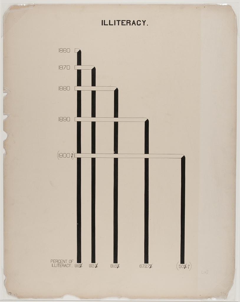
An important context of Du Bois’s graph of Black illiteracy is that literacy was illegal for enslaved people in the U.S. until emancipation and the Confederacy’s defeat during the Civil War. Illiteracy then declined rapidly as Black Americans sought to empower themselves through education. The Du Bois plotted this decline in illiteracy among Black residents in the state of Georgia in the figure below. They used decennial US census illiteracy rates for Georgia from 1860 to 1890 that are available here. They likely wrote “50%?” for the 1900 illiteracy rate because the Census did not publish 1900 illiteracy rates (available here) until several months after the Paris Exposition.

1. Syntax for Stata code
When we use code, we often separate different parts of the code’s instructions to the computer using parentheses, commas, and quotation marks. This is called syntax.
When we have multiple lines of code that need to work together in
stata, we place three backslashes /// at the end of each
line to tell Stata the code continues on the next line.
Every open parenthese and quotation mark needs to be closed. And all of these pieces need to be just right. When it’s not, the code won’t work and that can be frustrating.
We’ll try to give clear instructions so you can get the code right yourself. But chatGPT is a powerful tool for fixing little syntax problems. At any time, you can copy and paster your code into chatGPT and ask, why is this code not working?. Or, how can I fix this code so it runs? chatGPT is good for this kind of code debugging.
2. Reading and writing comments that explain your code
In a Stata .do file you can write comment text that
explains our code. We put a // before
comment text to tell Stata that the text is not code it
should execute. Any text after a // on a given line will be
treated as a comment. To see how this works, try the following
below:
- Try to run the code below. You should get an error message because
the comment text
This is code that adds 2+2is not Stata code and doesn’t have a//sign in front of it. - Add a
//sign beforeThis is code that adds 2+2and try to run the code again in your .do file.
3. Importing Du Bois’ data into Stata
The first step for data visualization in Stata is to import your data. This is like double clicking a file to open it in other computer programs. But with Stata, we use code.
There is no record of the exact data used by the Du Bois team for this bar graph. And the Du Bois graph curiously does not include tick marks with a labeled axis scale to show what exact values each bar represents. Why? Perhaps the Du Bois team wanted to emphasize that the bar graph was a rough comparison of illiteracy rates because of varied timing, methods, and national boundaries for measuring illiteracy rates at the time. The length of the “Negroes U.S.A” bar likely represents the national Black illiteracy rate of 57.1% reported by the 1890 US Census (see reported “Russie” (Russia) bar correspond to the national US Black illiteracy rate in the 1890 US Census (see here). So our data derives illiteracy rates for other countries based on the length of each country’s bar relative to “Negroes U.S.A.” bar, presuming the “Negroes U.S.A.” bar represents 57.1%.
We are also going to import a special Du Bois Stata scheme that adds graph settings that automates setting background colors and other graph choices to look like Du Bois’ graph.
For this exercise, we’re going to import the scheme from a *SSC (social science computing) website. Then we’ll import the Du Bois data from a website. In this case, the data is in a .csv (comma separated value) file.
The Stata code to import the Du Bois scheme from SSC
is ssc install dubois.
The Stata code to import the data file is
import delimited "web_address_with_data/data_file_name.csv", clear
The delimited word in the code tells stata that the file
is comma separated. At the end of the web location and file name, there
is a comma. After that comma we can add “specifications” to the command.
Here, the only extra specification is clear which tells
Stata to clear any data it has already loaded and replace it with the
data from the import command.
To do this yourself, replace the ____ portion of the
code below to add the import command.
Then, to confirm the data has imported, write the list
command to list all the data loaded in stata.
Then run these three lines of code in you .do file.
4. Creating a Bar Graph
After successfully listing the data above, you should be able to see that it has data in two columns. Each column is a variable: * country is a country name for 10 countries with Black people in the U.S. treated as a country. * illiteracy containts percent of people in each country who are illiterate.
As a first step, we will create a bar graph of the data using the shortest code possible. The code will:
repeat the code below that we wrote above to import the Du Bois illiteracy data.
Add a
graph hbarcommand.hbaris short for horizontol bar. After hbar we:
- include (
asis) in parentheses to tell Stata we want to graph each data point as it is listed in the dataset, rather than first computing its mean or some statistic from multiple data points per country. - list the bar value variable that determines the length of each bar.
- following a comma, specify the category variable for the categories
of each bar. We do this by writing the category variable name in
parentheses after the specification like this:
over(categoryvariablename)
After looking at Du Bois’ version of the graph above, replace the
_____ characters in the code cell below to plot the correct
variable as the bar value variable and the correct variable as the
category variable. Then run the code in your Stata Notebook
5. Changing the background color and aspect ratio
We can add some of the general Du Bois graphing style elements just by adding the Du Bois Scheme to the graph code.
For example, we can change the background color and the aspect ratio (ratio of graph width to graph height) this way.
To add the Du Bois scheme, we add the scheme(dubois)
specification at the end of the comma. Fill in the blank in the code
below to do this. Then run it in you .do file.
6. Ordering the Bars and Making the Bar for Black Americans a Different Color
In the bar graph you created above, can you tell what order the bars for each country are sorted by?
Du Bois sorts the bar for each country by its illiteracy rate from
highest to lowest. To do this in stata, we need to generate an negative
illiteracy variable to sort bars in descending order (the most negative
illiteracy rate is the smallest value, which will then sort from lowest
to highest). This is done by the
gen illiteracy_neg = -illiteracy code below.
To graph the Black U.S. bar in a different color, we also need to
create separate illiteracy variables for Blacks in the U.S. and for all
other countries. This is done by the
separate illiteracy, by(country=="Negroes, U.S.A.") code
below.
Fill in the blanks below to graph bars for the two separate illiteracy variables and sort bars in descending order with illiteracy_neg.
STATA
ssc install dubois
import delimited "https://raw.githubusercontent.com/HigherEdData/Du-Bois-STEM/refs/heads/main/data/d_literacy_country.csv", clear

// below generatees a Negative illiteracy value for descending sort
gen illiteracy_neg = -illiteracy
// below creates separate illiteracy variables to graph, illiteracy1 for Black U.S. illiteracy0 for others
separate illiteracy,  by(country=="Negroes, U.S.A.")

// fill in the blanks below with the new illiteracy1 variable name
graph hbar (asis) illiteracy0 illiteracy_, ///
    over(country, sort(________))  /// fill in the blank here to add the illiteracy_neg sorting variable
    scheme(dubois) ///
    bar(1, color(green)) ///
    bar(2, color(red)) ///
    nofill // nofill tells Stata to not have a line break between different variables bars
7. Turn the legend off grid lines off. Make the Country label text smaller.
The country label text is now a bit large. So we add the following
label text size code label(labsize(1.5)) to make it
smaller. This code has to go within the over()
specficiations parantheses. Its tricky, so we’ve done it for you.
Using separate bars for Black U.S. illiteracy and for other countries
added a legend that Du Bois did not use and that is not necessary. To
remove this legend, we simply add a line legend(off) line
of code.
Du Bois also did not use grid lines or axis labels to show bar
lenght. To implement this, we add a line of code
ylabel("", nogrid) Where the empty quotation marks tell
Stata there should be no Y axis labels (even though the graph is
horizontal, Stata still considers the bar length axis the Y axis).
Fill in the blanks below with off and
nogrid to complete these lines of code. Then run them in
your .do file.
STATA
ssc install dubois
import delimited "https://raw.githubusercontent.com/HigherEdData/Du-Bois-STEM/refs/heads/main/data/d_literacy_country.csv", clear

gen illiteracy_neg = -illiteracy
separate illiteracy,  by(country=="Negroes, U.S.A.")

graph hbar (asis) illiteracy0 illiteracy1, ///
    over(country, sort(illiteracy_neg) label(labsize(1.5)))  ///
    scheme(dubois) ///
    bar(1, color(green)) ///
    bar(2, color(red)) ///
    nofill ///
    legend(___) /// set legend to "off"
    ylabel("", _______) // set nogrid lines with empty ylabels
8. Add the Titles and Subtitles with Your Own Name
To add titles and subtitles to the graph, we use the title and subtitle specifications.
The title text needs to be enclosed in quotation marks. We use lines
with empty quotation marks " " to and line spaces between
title and subtitile lines.
Fill in the blank with your name in the title code below to show that the graph was recreated by you!
Finally, an extra
graph export dubois_literacy.jpeg, replace line of code
that is not part of the graph hbar command. This exports a copy of your
graph to a jpeg file that you can submit for this assignment!
STATA
ssc install dubois
import delimited "https://raw.githubusercontent.com/HigherEdData/Du-Bois-STEM/refs/heads/main/data/d_literacy_country.csv", clear

gen illiteracy_neg = -illiteracy
separate illiteracy,  by(country=="Negroes, U.S.A.")

graph hbar (asis) illiteracy0 illiteracy1, ///
    over(country, sort(illiteracy_neg) label(labsize(1.5))) nofill ///
    scheme(dubois) ///
    bar(1, color(green)) ///
    bar(2, color(red)) ///
    legend(off) ///
    ylabel("", nogrid) ///
    title("{stSerif}Illiteracy of the American Negroes compared with that of other nations." ///
            " ", size(3)) /// Add main title
    subtitle("{stSerif}Proportion d' illettrés parmi les Nègres Americains comparée à celle des autres nations." ///
            " " ///
            "{stSerif}Done by Atlanta University." ///
            " " ///
            "{stSerif}Recreated by _______________", /// add your name here to generate a graph with your name
             size(2)) //

graph export dubois_literacy.pdf, replace
9. Change the Data to Read in and Display College Degree Holding By Country
Now that you’ve written code to graph Du Bois’ literacy data, you can use that same code to make bar graphs of other data in the same style.
To see how this works, fill in the blank below to import our d_college_country.csv dataset instead of the literacy dataset.
List will then display all of the country names and college attainment rates the data.
We obtained this data for the same countries that Du Bois graphed literacy in 1900.
We obtained the country level data from the most recent data reported by the OECD here: https://www.oecd.org/en/topics/sub-issues/education-attainment.html
We obtained the Black college attainment rate data for the U.S. from: https://www.luminafoundation.org/stronger-nation/report/#/progress/racial_equity
10. Edit the Code to Graph the College Attainment Data
After reading in the d_college_country.csv data, you can edit the graph code you used for the literacy code to graph the college data.
Fill in the blanks below to:
- Change the bar variables you are graphing from literacy to the college variables.
- Change the subtitle of the graph to be a translation of the title to the language of your choice. Du Bois translated his graph title to French for his 1900 Paris Exposition audience in France.
- Add your own name for the Adapted by line.
STATA
ssc install dubois
import delimited "https://raw.githubusercontent.com/HigherEdData/Du-Bois-STEM/refs/heads/main/data/d_college_country.csv", clear

gen college_neg = -college
separate college,  by(country=="Black U.S. Residents")

** fill in the blanks below to graph the college variables
graph hbar (asis) __________0 __________1, ///
    over(country, sort(college_neg) label(labsize(1.5))) nofill ///
    scheme(dubois) ///
    bar(1, color(green)) ///
    bar(2, color(red)) ///
    legend(off) ///
    ylabel("", nogrid) ///
    title("{stSerif}College attainment by Black U.S. residents compared with that of other nations." ///
            " ", size(3)) ///
    subtitle("{stSerif}Translation in language of your choice." /// add your translation here
            " " ///
            "{stSerif}Done by Atlanta University." ///
            " " ///
            "{stSerif}Recreated by _______________", /// add your name here to generate a graph with your name
             size(2)) //
11. Improve Accessibility by Adding X Axis Grid Lines and Removing the Use of Red and Green
Some of Du Bois’ graphing choices might not make sense for graphs you want to make.
For example, Du Bois doesn’t provide labels or grid lines to make it easy to understand what the range of college attainment rates are for the countries. Delete the line of code below that removed the grid lines to restore them
In addition, red and green bars are difficult to differentiate for those with colorblindness. Edit the line of code that set the bar colors to green and red to change the colors to orange and blue which are colorblind accessible.
Then run the code with the graph export command below to create a jpeg that you can submit for an assignment.
If you want to customize the chart further to add your own style twist, try a google search or chatGPT query. For a chatGPT query, you could copy and paste the code from below and ask, how could I change this R ggplot code to change the font color to pink
STATA
ssc install dubois
import delimited "https://raw.githubusercontent.com/HigherEdData/Du-Bois-STEM/refs/heads/main/data/d_college_country.csv", clear

gen college_neg = -college
separate college,  by(country=="Black U.S. Residents")

graph hbar (asis) college0 college1, ///
    over(country, sort(college_neg) label(labsize(1.5))) nofill ///
    scheme(dubois) ///
    bar(1, color(______)) /// try blue
    bar(2, color(______)) /// try orange
    legend(off) ///
    ylabel("", nogrid) /// delete this line of code to restore grid lines
    title("{stSerif}College attainment by Black U.S. residents compared with that of other nations." ///
            " ", size(3)) ///
    subtitle("{stSerif}Translation in language of your choice." /// add your translation here
            " " ///
            "{stSerif}Done by Atlanta University." ///
            " " ///
            "{stSerif}Recreated by _______________", /// remember to include your name here to generate a graph with your name
             size(2)) //

graph export dubois_college.pdf, replace
STATA
Content from Learning Evaluation
Last updated on 2026-04-28 | Edit this page
We will publish learning evaluation materials here including a SCORM file with a CANVAS quiz. The CANVAS quiz will contain links to answer keys for coding interactives that will be accessible only to instructors.
We are also developing a system for providing answer keys to instructors for coding interactives and other learning evaluation activities that doesn’t use Canvas.